The Vanguard Digital Advisor is a new robo-service that provides automated
investment assistance. I was tasked to create an accessible experience for
those just starting their financial journey, targeting specifically young
adults in my process.
Challenge
Many young professionals are not investing because they lack the knowledge of
knowing where to invest, how to invest, how to manage portfolios, etc. The challeneg of this project was
to redesign the robo-advisor page to cater towards young professionals who are interested in investing but don't know where to start.
Proposed Solution
I suggested improving the beginner investing platform's website by adding comprehensive information about the Robo advisor, highlighting Vanguard's special features, and enhancing investment details based on user feedback for increased transparency and usability.
Takeaway:
Users lack understanding of investing and financial terms.
The usability testing revealed positive feedback regarding the platform's visual representation of funding progress, prominent display of total assets, upfront fee presentation, intuitive dashboard hierarchy, engaging aesthetic, and seamless navigation. However, limitations included varied participant knowledge of investing, awareness of the UX test, and a small sample size. Minor issues included inconveniences unlikely to deter users.
Can you tell me about your overall experience with any financial services or investing?
What do you feel might be a barrier to financial literacy/investing?
Is there any financial-related information you have found to be difficult to understand?
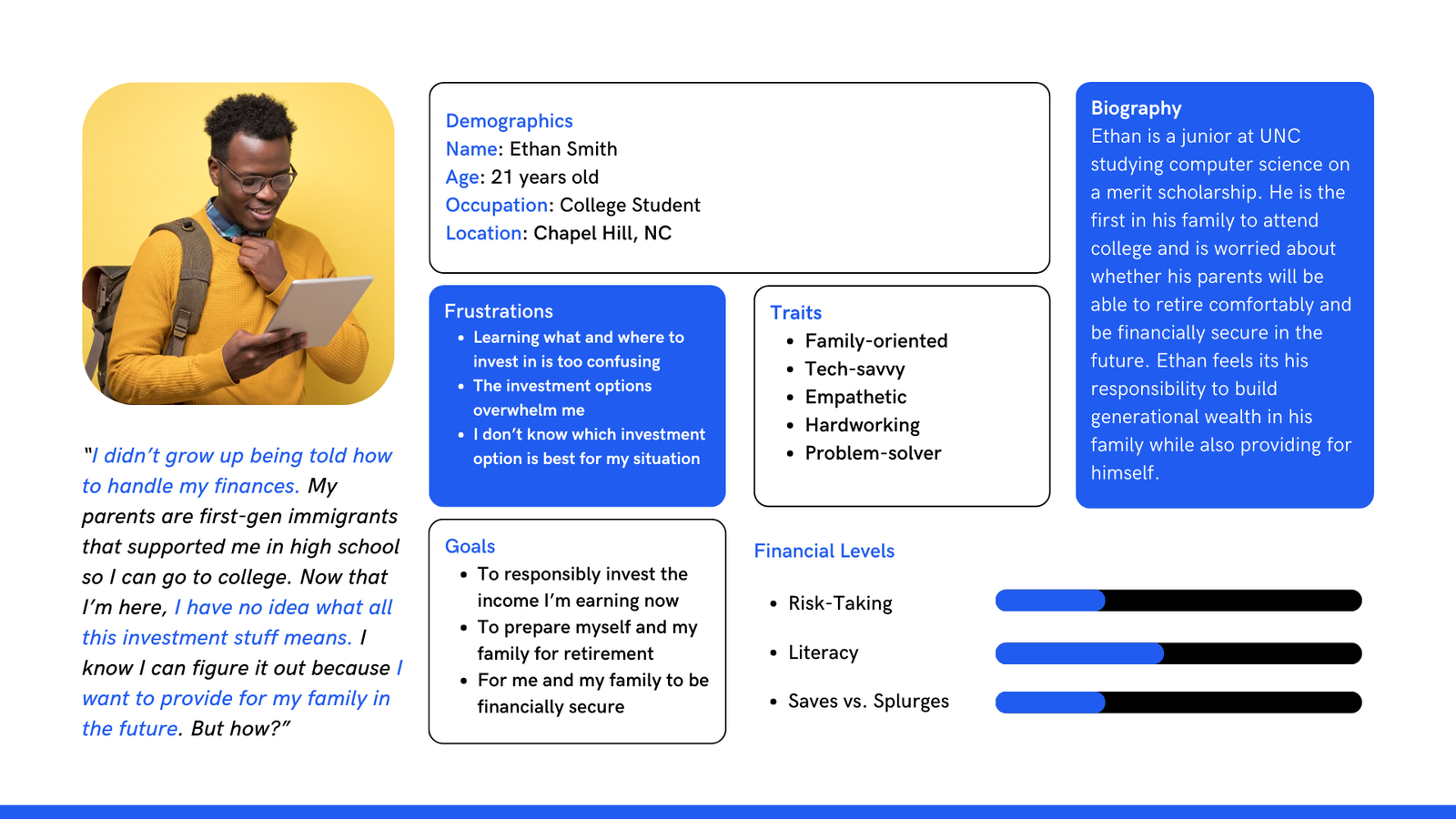
I identified a core pain point from each of the users, which were apprehension about using AI to manage portfolios and
intimidation to investing due to a lack of investing knowledge.
Compiling my research into personas helped me simplify my goals into actionable insights.
Taking into account the primary types of users, upcoming graduating students and young professionals, I was now ready to start the design.
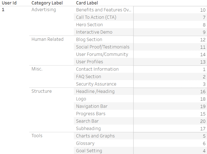
I used language learning models (LLMs) to generate a list of elements commonly featured on financial investment sites like Vanguard. I pared down the list by cross-referencing similar elements I saw from different LLMs and turned them into cards on kardSort.
I then asked 10 individuals to sort these cards into categories that they created themselves based on how they felt these cards should be organized. I graphed this data using Tableau and you can see my final graph here.
While some categorized elements by function, others used their familiarity with financial websites to categorize what they felt was "necessary" versus "unnecessary".
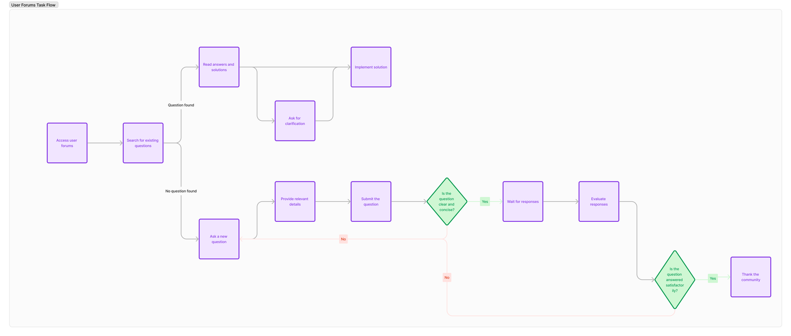
Considering the flows for potential users helped us determine
opportunities for improvements, such as including an educational page for users to learn more financial literacy and learn how to invest.
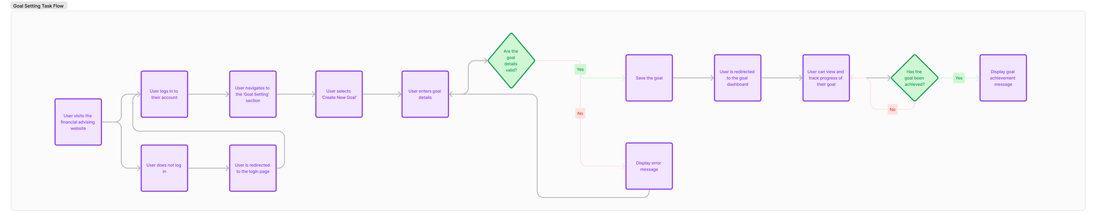
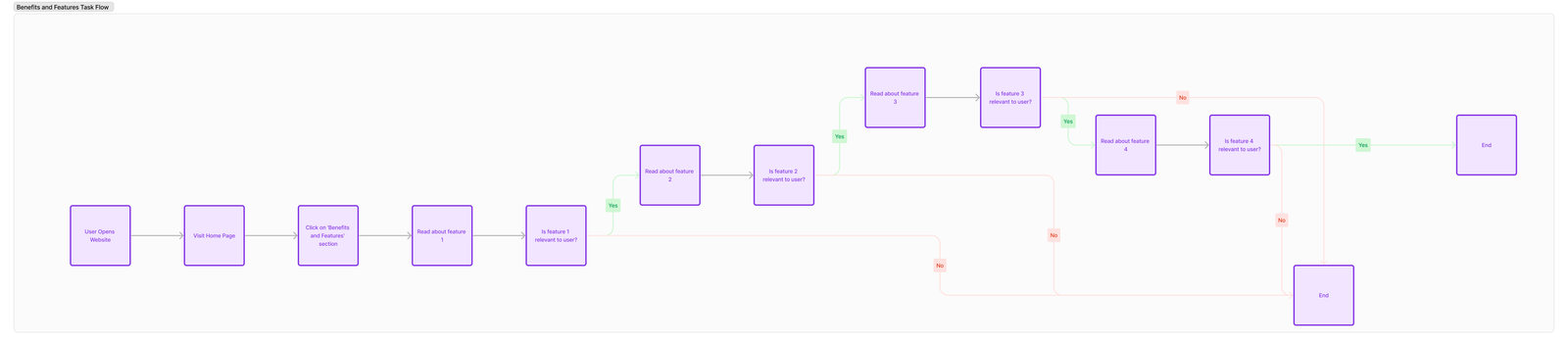
I created a wireframe/low-fidelity prototype based on the user flow for setting a goal. I chose this user flow because I felt this would be one of the most frequently used features that users would use when interacting with Vanguard's Digital Advisor service.
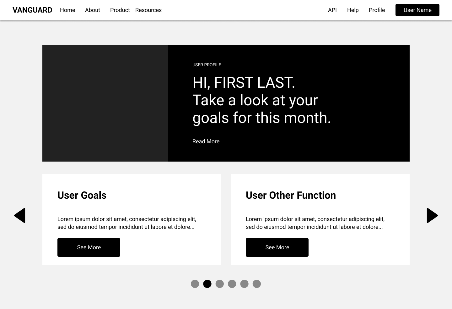
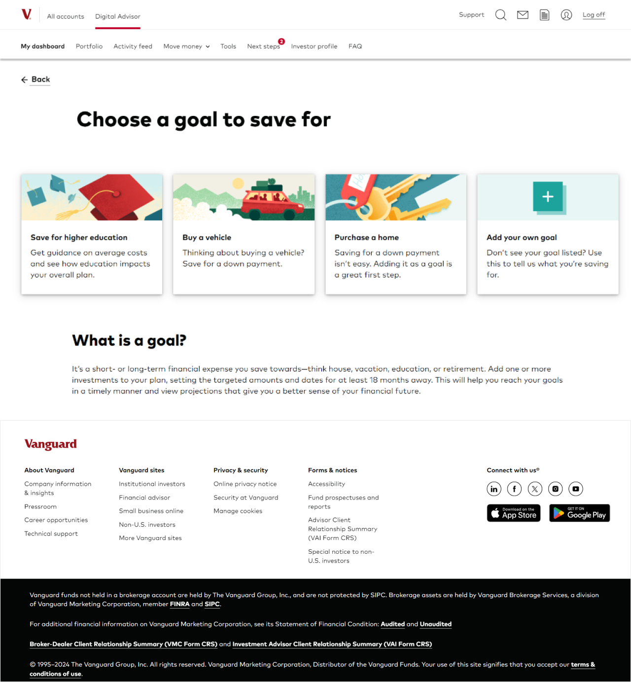
My high-fidelity prototype builds on the wireframes and implements additional features to improve user experience. The key feature here is the goals section,
which allows users to personalize their expereince with the robo-advisor.